Re-designing Call Review.
The most-used page in Wingman → Clari Copilot, where reps and managers spent 90% of their time, had accumulated five years of features and served none of its users well. I led the redesign around one question: can we help you find the right moment in any call?
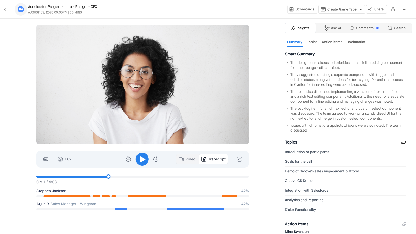
Six years, one page.
Some quick history, because it matters to this story. I joined a three-person YC startup as employee #3 in October 2018. We rebranded strings.ai → Wingman in ten days before Demo Day, I ran solo at a 12:1 designer-to-engineer ratio, then hired the design team out. Clari acquired us in June 2022 and Wingman became Clari Copilot; I stayed on as Design Manager and later led AI design across the portfolio.
Through all of it, one surface mattered more than everything else combined: Call Review. Wingman joined your sales calls as an invisible participant, transcribed them within minutes, and Call Review was where you watched, read, commented, scored and shared. Reps, managers, enablement: everyone, every role, every day, ended up on this page. Roughly 90% of product usage ran through it.
The page everyone used differently, and no one loved.
By mid-2023, Call Review had become a page everyone used and no one loved: share, scorecards, game tapes, five different types of highlights, search, and AI summaries all bolted on, each feature earning its place individually while nobody owned the whole. But it didn't get there overnight. Step back through its life.
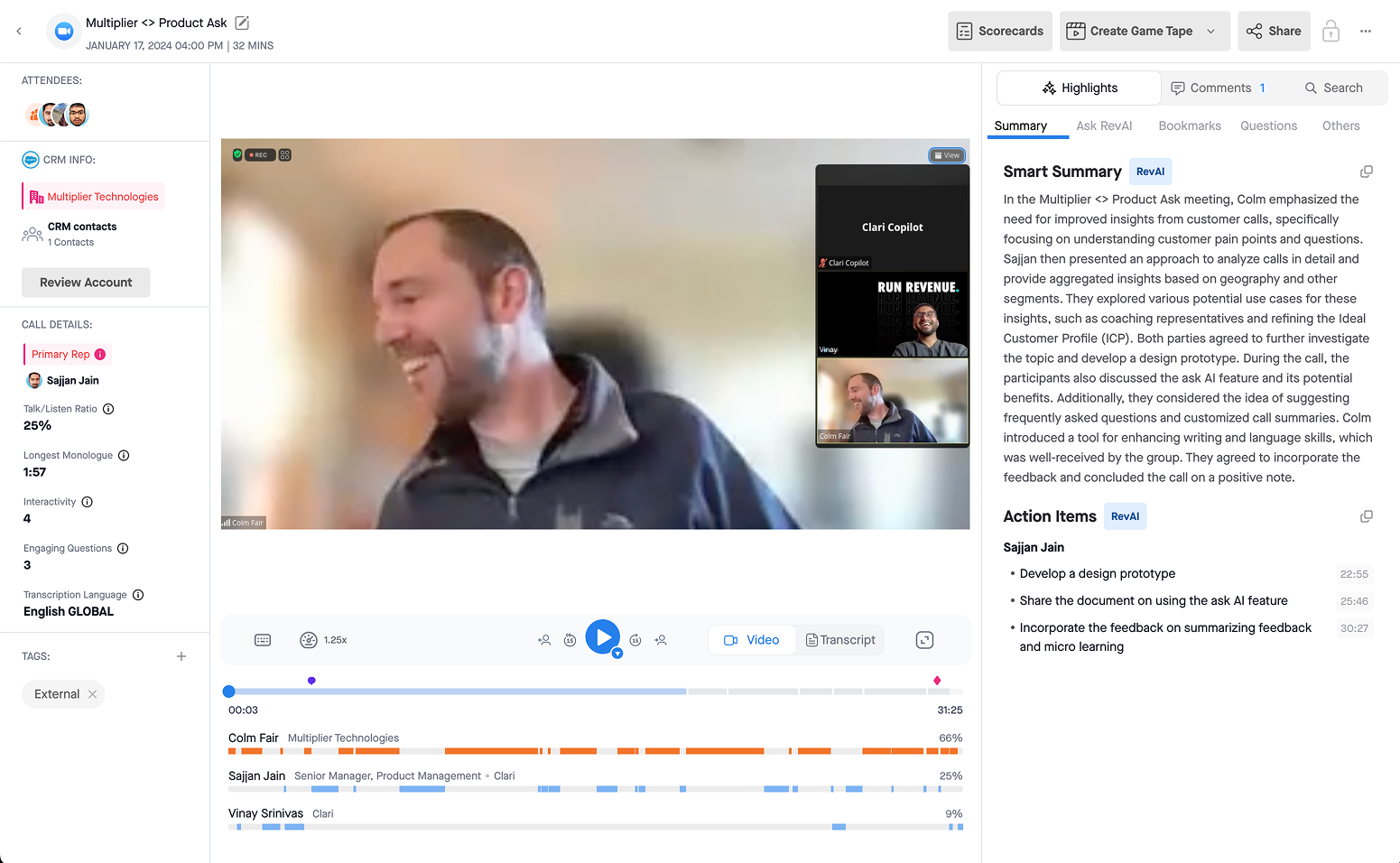
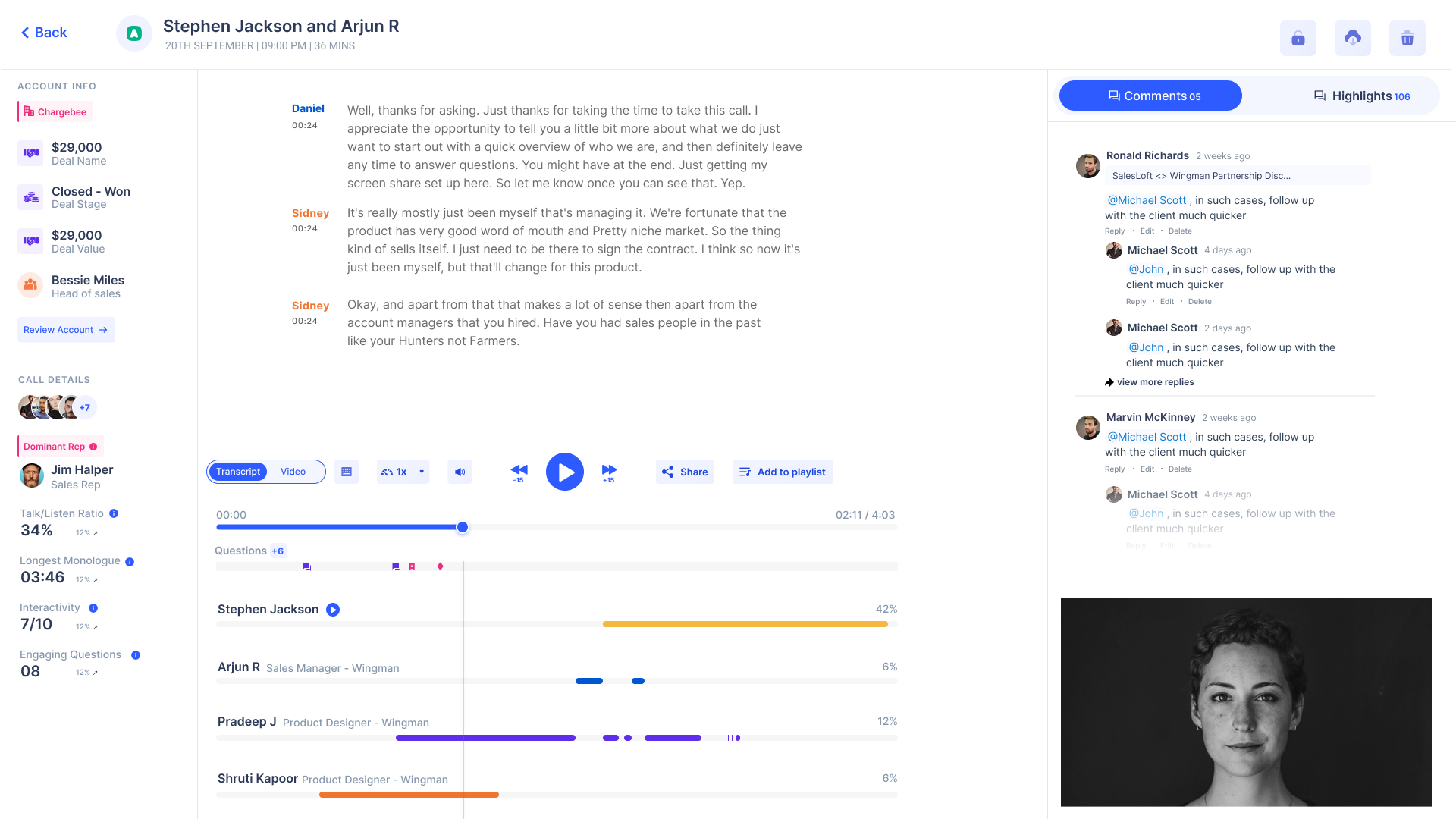
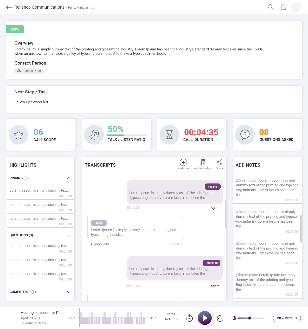
Every role that touches a deal ends up in Call Review, at a different stage, wanting a different thing. Map the sales cycle and Copilot shows up at six-plus stages (discovery, demo, follow-up, close, onboarding, expansion), which is exactly why 90% of usage lands here. It's the one surface the entire revenue team shares, and it was tuned for none of them.
One page, three-plus jobs, zero prioritization between them. And ChatGPT's arrival made the divergence impossible to ignore: people suddenly had opinions about what AI on this page should do for them.
Heap told us what. FullStory told us why.
By the time the redesign got the green light, we'd been collecting evidence for the better part of a year: customer complaints, Slack threads, support tickets, and our own design audits, intensifying in the quarter before kickoff, on top of everything else we were shipping.
The method the team ran: Heap for behaviour (which actions users actually take, segmented by role) and FullStory for intention, pulling targeted session replays that explain why. We mapped the core journeys (discovery, skimming and catching up, coaching and feedback), audited every element on the page with a shared nomenclature, and tore down competitors for good measure.
The share/trim flow alone, one feature on the page, carried a 17-item P0 feedback list: no timeline after trimming, no seek bar in the trim flow, shared links that weren't discoverable so users trimmed the same call twice, no way to expire a link without re-trimming. Heap put the share funnel at conversion across users. Customer Slack threads kept surfacing the same confusions. That's one feature. The page had fourteen modules.
Patch the page, or rebuild it.
I'd been pushing for this redesign for close to nine months. Everyone agreed the problems were real; it just kept losing to bigger ones, with Unification running in parallel. "Next quarter," every quarter. So the first explorations were patches: how do you make AI summaries first-class inside the existing UI without a rebuild?
Four rules that decided every argument.
Once we committed to the rebuild, the details could have gone a hundred directions. These four principles, distilled from the research rather than invented after, are what actually settled the debates.
Two columns, one question: where's the moment?
The north star for every decision: help users find the right moment in any given call, as fast as possible. Everything either serves that or gets out of the way. The page went from three columns to two, call on the left and insights on the right, organized around the three jobs the research surfaced: discovery, skimming, coaching.
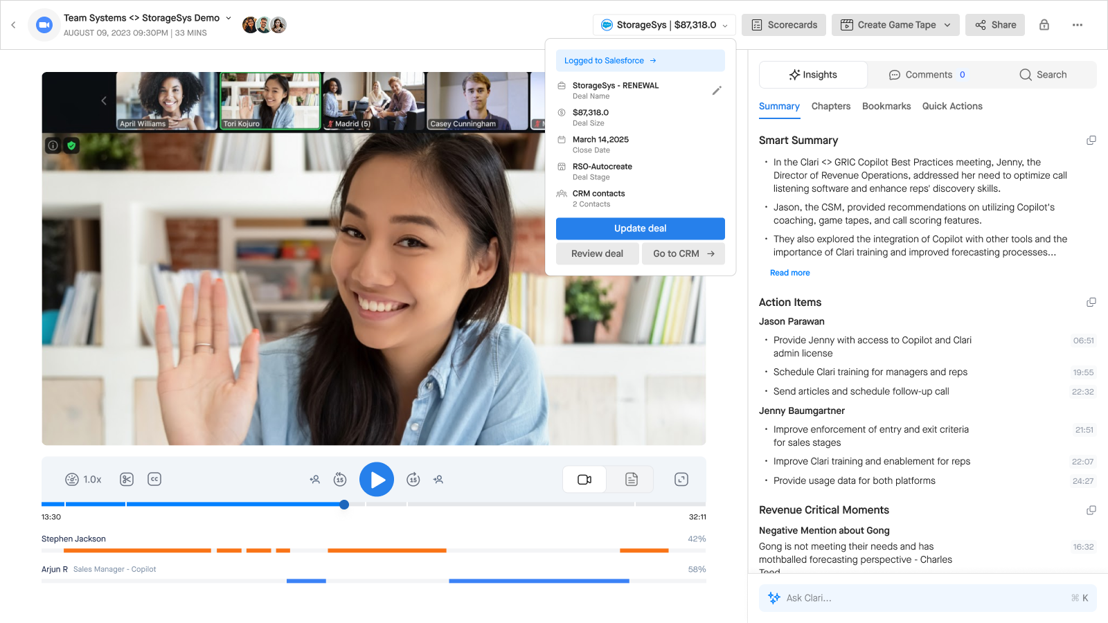
The old left column (attendees, CRM info, call details, tags) had to go somewhere. One direction we explored: fold it into a disclosure in the top bar, glanceable on click instead of taking up permanent space. It's the context a rep checks, not the content anyone reads for minutes. We kept iterating on where that context should live before landing on the two-pane layout that shipped.
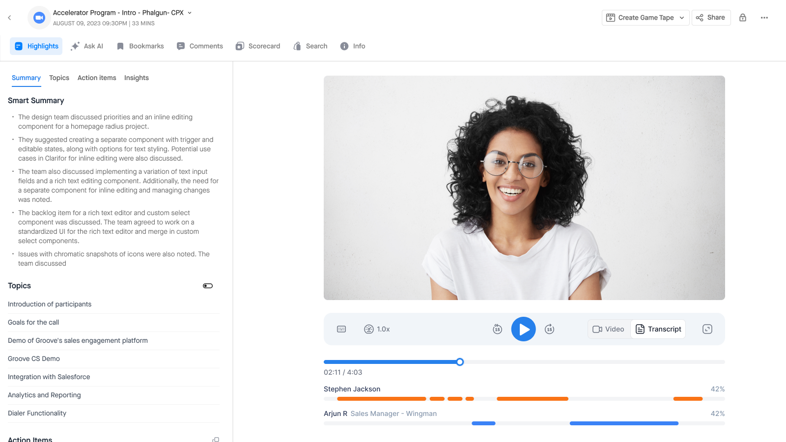
AI-generated Smart Chapters became the skeleton of the call. They appear as an overlay on the video, as an outline threaded through the transcript so you can jump section to section, and they divide the seek bar itself: the timeline stops being a featureless strip and becomes a map.
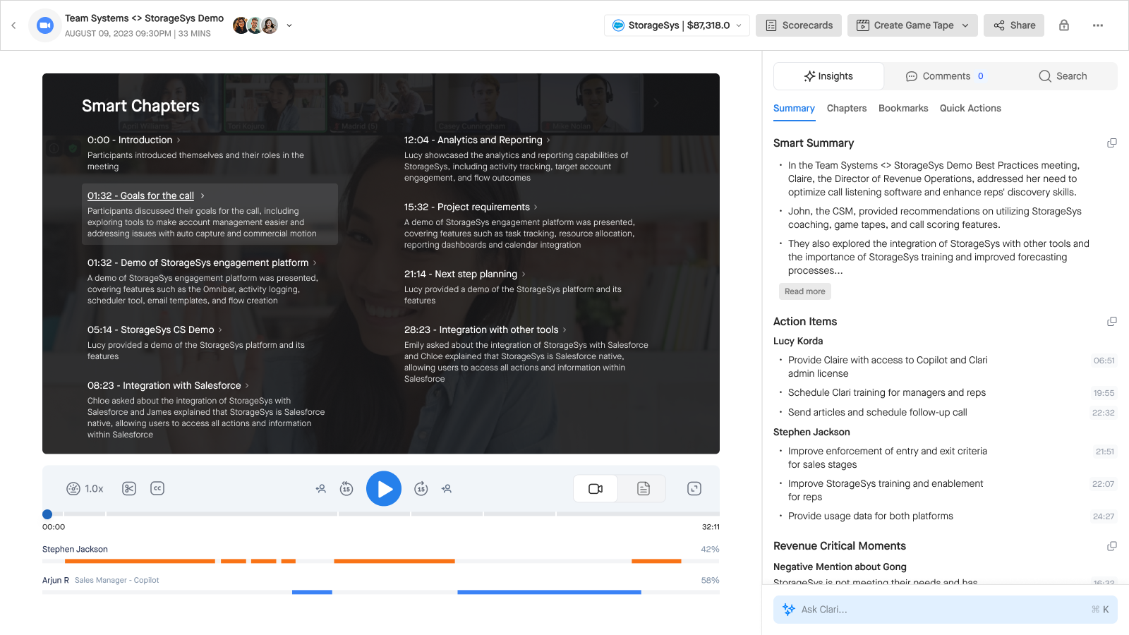
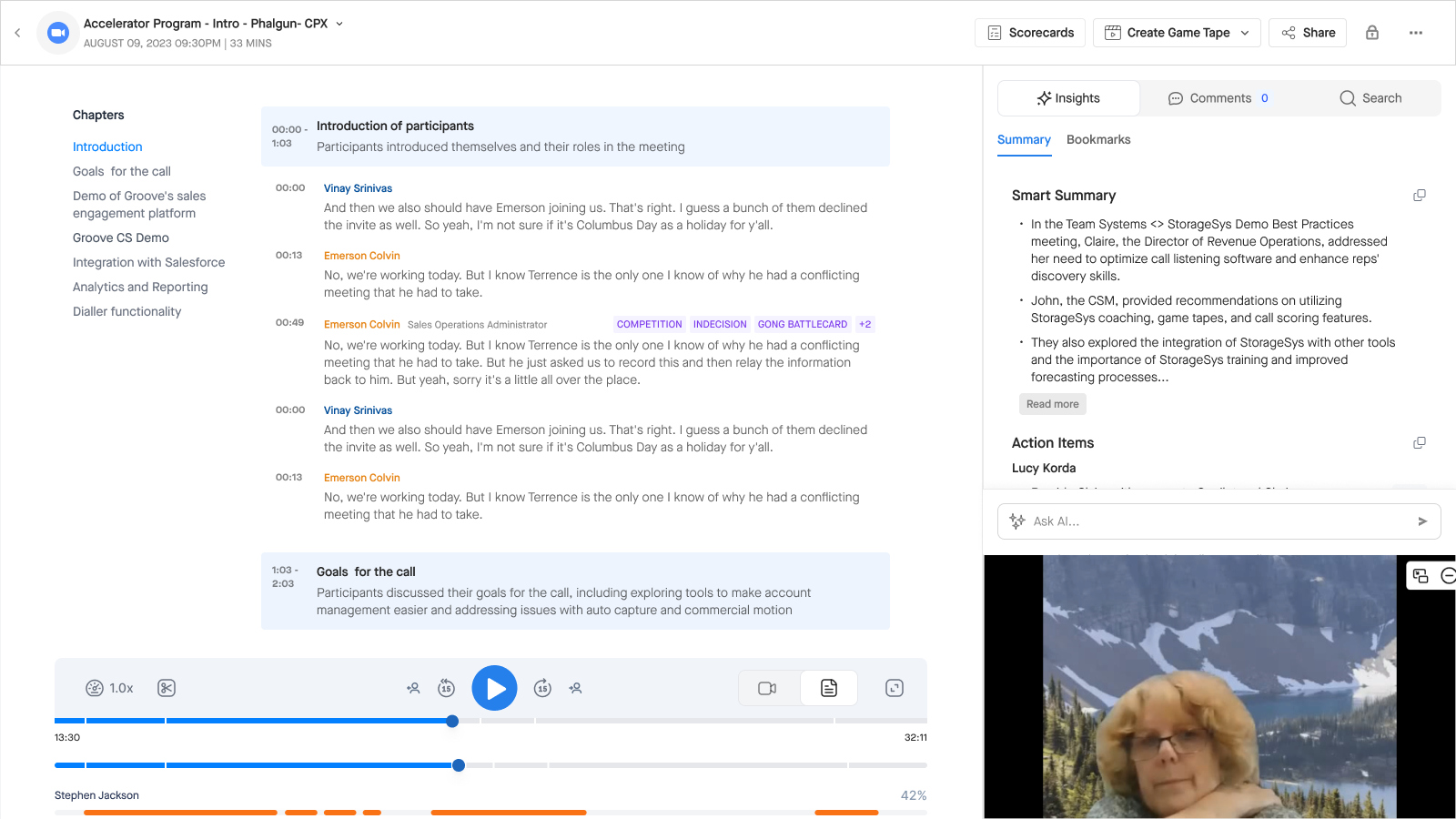
The FullStory sessions showed people fighting the layout to see both at once, so the toggle became a side-by-side. Managers skimming a rep's calls move through speaker timelines, chapters and transcript without ever swapping views or losing their place. The two-year-old complaint from user testing became the default state.
The right column is the AI surface: Smart Summary, Action Items with assignees and timestamps, Revenue Critical Moments, and Ask AI, with comments and scorecards alongside. A manager can score while watching; a rep can grab the summary and go. The five competing highlight types collapsed into one insight rail.
Because Copilot now lived inside the Clari platform, the page could act on the deal, not just describe it. Calls push to the CRM automatically, and the states are explicit (logged, needs manual push, failed with a reason) with one-click fixes.
Zoom arrived at the same answer.
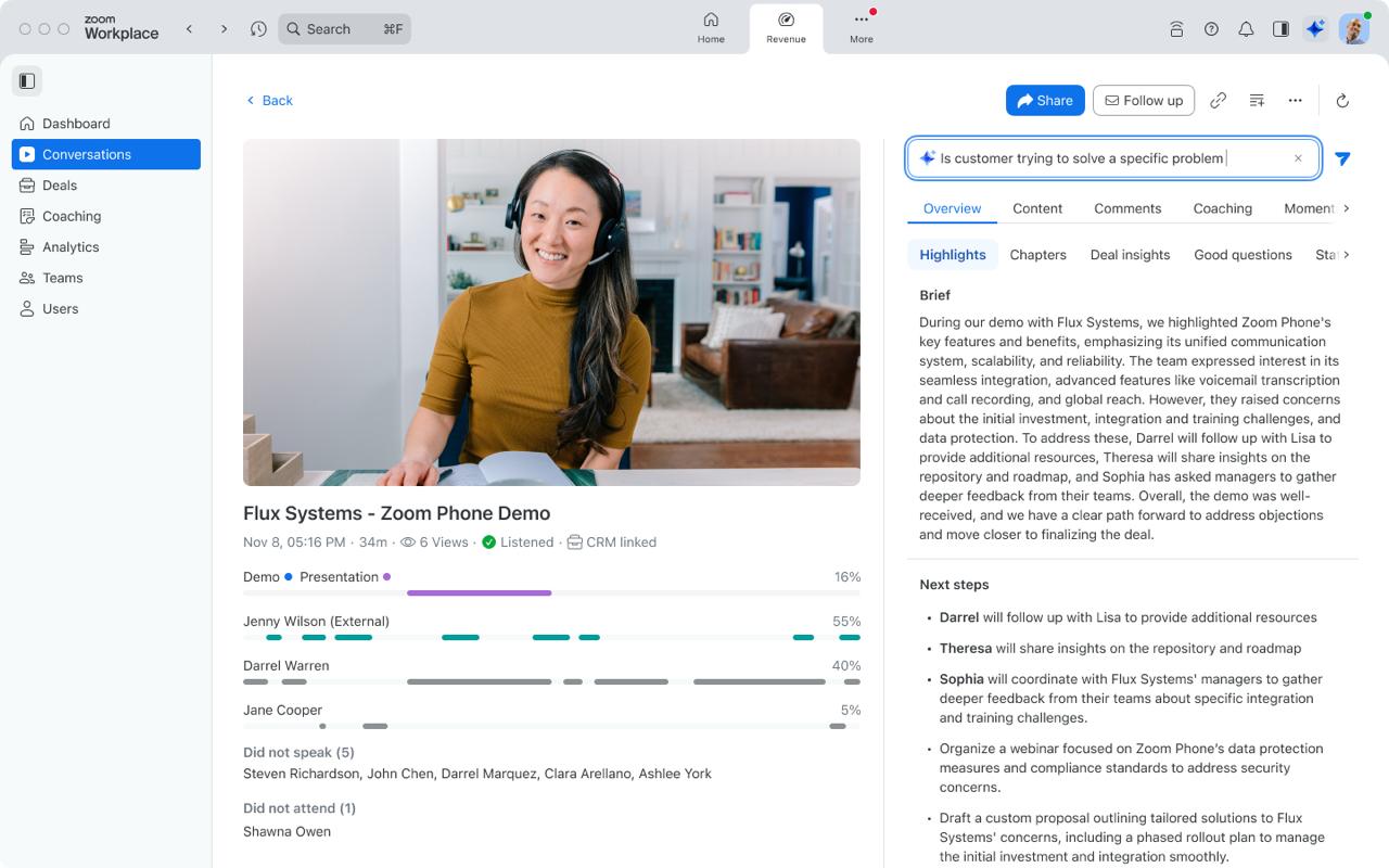
In October 2024, my last weeks at Clari, Zoom announced its revenue-intelligence product. Set aside the outer chrome (their first column is product navigation) and look at the call surface itself: video with speaker timelines in the center, AI summary and next steps in a right-hand insights panel, share in the top-right.
The same content structure we'd shipped 18 months earlier. Zoom has hundreds of designers and unlimited budget; they could have designed anything.
Three things I'd change on the next one.
Package the evidence into a story sooner.
Nine months of "next quarter" wasn't a disagreement about the problems; everyone agreed they existed. It was a prioritization queue, and I was bringing observations to a fight that needed a narrative. If I'd assembled the Heap funnels, the FullStory sessions and the 17-item share-flow list into one leadership-ready story in month two instead of month eight, I think this redesign starts two quarters earlier.
Put a subtraction rule in design review, not in my memory.
The bloated layout was my own design plus five years of reasonable additions, and nothing in our process forced a removal when something got added. If we'd made "every addition names a subtraction" a standing rule in design review from day one, the next version wouldn't need a hero project to fix; it would have stayed legible on its own.
Instrument the job before shipping, not after.
We measured feature usage (share clicks, search events, tab switches) but never the job itself: time from opening a call to finding the moment you came for. If I'd defined and instrumented that metric before launch, the north star would have been provable instead of directional, and we'd know today which of the three chapter surfaces is actually doing the work.
Six things this page taught me.
Your own success becomes the problem you solve next.
The layout that bloated over five years was mine. Products rarely decay because someone designed them badly; they decay by accumulation, one justified addition at a time, with no one owning the coherence between them. Learning to redesign your own work without defending it is a specific skill, and worth building early.
Heap tells you what happened. FullStory tells you why.
Event data said "search is barely used." A fact, not a reason. Only the session replays showed what people were doing instead: resizing video to read transcripts alongside it, marking already-private comments private again because they didn't trust the label. You need both layers before you're allowed to cut anything.
One feature can hide an iceberg.
Share and trim, on their own, carried a seventeen-item P0 list and a 25% funnel. Multiply that by fourteen modules on the page, and "this feels cluttered" stops being a taste judgement and becomes a systemic one. Audit at the feature level before trusting any page-level verdict.
Setting direction meant unlearning my own pattern first.
I was directing two designers on a rebuild of a page I'd originally shaped. The hardest part wasn't the craft. It was arguing against my own earlier decisions in the room, out loud, without treating the critique as personal. That's a different muscle than shipping a screen, and this project is where I actually built it.
A shared vocabulary is worth the unglamorous hour.
Before any layout work started, we audited and named every element on the existing page: seek bar, speaker timeline, transcript toggle, all of it. It felt like busywork at the time. It's the only reason three designers and two PMs could debate the redesign without three different names for the same rectangle.
If the structure is right, others arrive at it independently.
Zoom converging on the same content IA, without ever seeing our process, eighteen months later, is the strongest design review a layout can get. Not that the work shipped, but that it became the obvious answer to someone who started from zero.